Monday, August 20, 2007
A quick look at colouring an Unicity page
Well, firstly I will be the first to say that I will probably suck at trying to put together a tutorial but what the hell... here goes.
INK/LINES
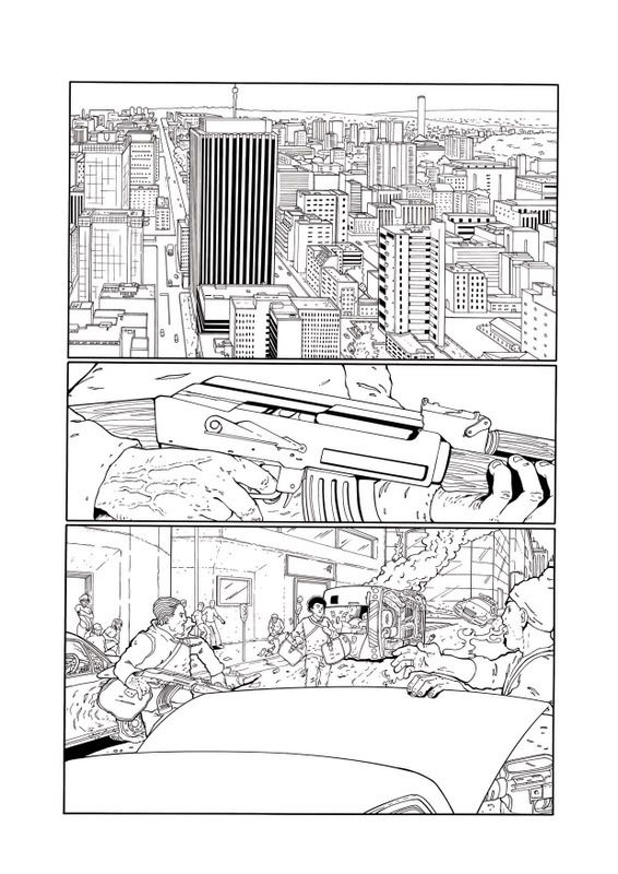
First of all comes the scan of the pencilled page which is tweaked in Photoshop to make it nice and clean with no smudges, specks or grays. I do this by upping the Brightness and Contrast until I get the desired result. If there is some gray/shadowy bits from scanning I will brush over the guilty areas with my Dodge tool set on Highlight with a soft edge brush and the exposure on something like 12%.
FLATS
Next I duplicate that layer so that I have two layers with the linework on it. The top layer I will set to Multiply (and rename it to LINES... just to avoid confusion) The bottom layer will be my flats but I adjust the levels slightly so that the linework on the bottom layer becomes thinner than the top Lines layer (that way colour will fill beneath the lines on the LINES layer and you wont get the gray "scunge" pixels)
Choosing your colours is important too! You want your page to be realistic and easy on the eyes!
Flats layers are handy for selecting whole areas of colour so its a good idea to lock the layer... that way you won't accidentally work on it.
RENDERING
Right... with me so far? I hope so (Im taking into account that peeps who look at this have some knowledge of Photoshop...)
Next we come to the fun part and that is Rendering!
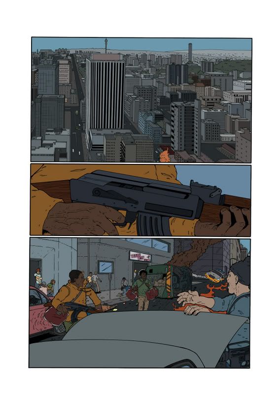
There are many styles of rendering... 2-tone, airbrushing, gradient fills etc... my method is a mixture of airbrushing and using lasso selections.
Duplicate your Flats layer and rename it RENDER (again... avoiding confusion) This is the layer that you apply all your highlights and shadows etc.
Some people render using more than one layer ie: the backgrounds, shadows and highlights each have their own layer. Whatever suits you best.
SPECIAL FX
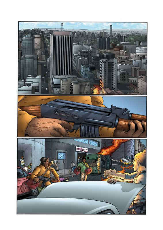
Sometimes a page calls for extra effects like glows and colour holds. A colour hold is a term used for colouring the actual lineart! If you want to try this here is a quick way to get the lineart as a selection...
Alt+click on the eye icon of the LINES layer (this will make only that layer visible)
Go to your Channels and CTRL(Apple) =Click on the Cyan channel
Invert the selection (this will make the black lines selected)
Save the selection and voila! You now have the lines available as a selection if need be
Here you can see where I have coloured the lines of the fire...
This layer will obviously be above the LINES layer
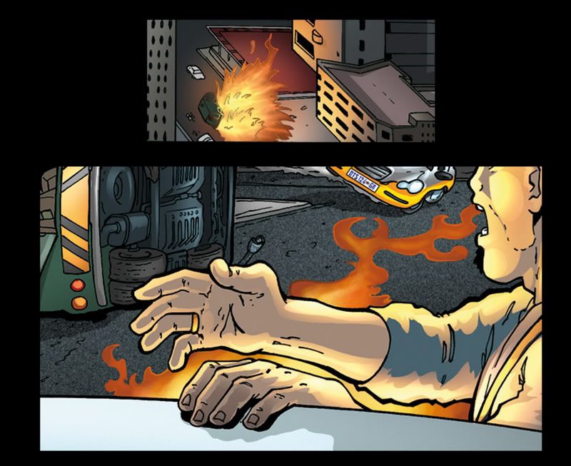
Special effects such as glows are usually done on a layer above the LINES layer and the layer is set to Screen...
A soft edge airbrush will usually do the trick
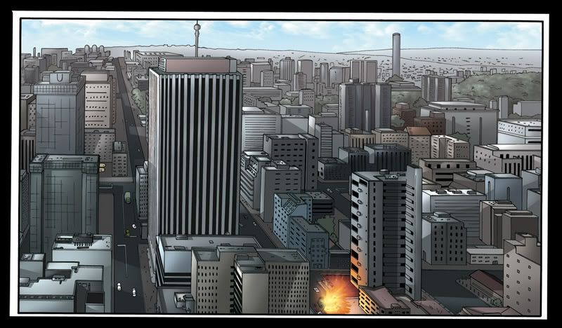
On the top panel I added a haze to get the effect of depth and distance. It was merely a new layer on which I airbrushed the hazey atmosphere. Just set the opacity on your brush very low and you can gradually build up the desired effect
ALTERATIONS
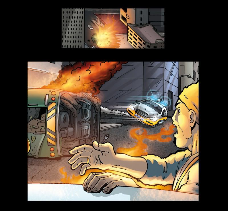
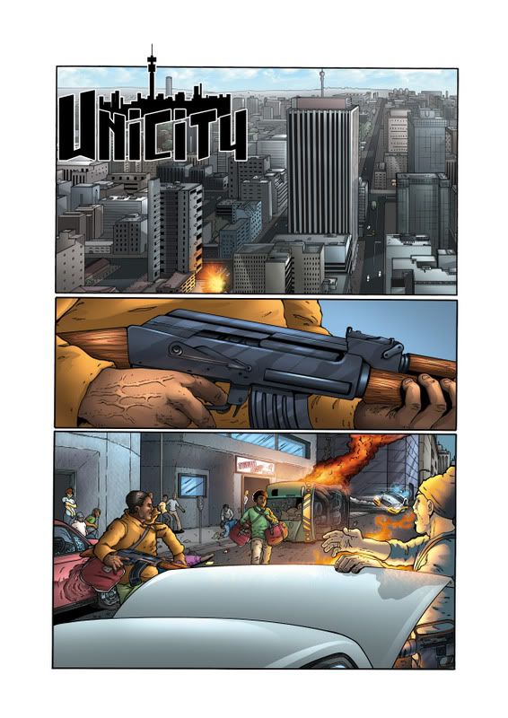
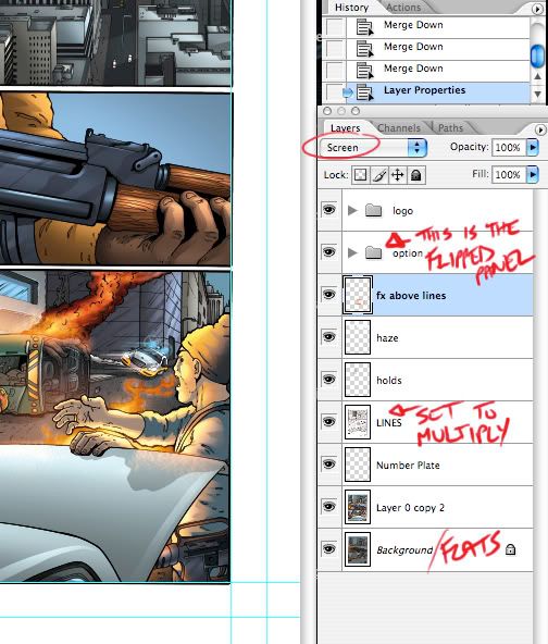
Sometimes a page might not work out as you thought it would. In this particular page's case the Unicity logo was covering too much of the cool buildings that Karl had illustrated. So, I had to flip the top panel. "ARGGGH a nightmare with all those layers!" I hear you roar... not so. All I did was duplicate the whole page, flattened it then cut the top panel out and pasted it on a new layer above everything. No problem.
FIN
And there you have it! I hope this helps someone as I sometimes take for granted that people know what Im talking about! LOL
Here is what my layers looked like just in case anyone was wondering... gah! Looks like I didn't even name my layers properly... oh well!
Happy Colouring!
AC
INK/LINES
First of all comes the scan of the pencilled page which is tweaked in Photoshop to make it nice and clean with no smudges, specks or grays. I do this by upping the Brightness and Contrast until I get the desired result. If there is some gray/shadowy bits from scanning I will brush over the guilty areas with my Dodge tool set on Highlight with a soft edge brush and the exposure on something like 12%.
FLATS
Next I duplicate that layer so that I have two layers with the linework on it. The top layer I will set to Multiply (and rename it to LINES... just to avoid confusion) The bottom layer will be my flats but I adjust the levels slightly so that the linework on the bottom layer becomes thinner than the top Lines layer (that way colour will fill beneath the lines on the LINES layer and you wont get the gray "scunge" pixels)
Choosing your colours is important too! You want your page to be realistic and easy on the eyes!
Flats layers are handy for selecting whole areas of colour so its a good idea to lock the layer... that way you won't accidentally work on it.
RENDERING
Right... with me so far? I hope so (Im taking into account that peeps who look at this have some knowledge of Photoshop...)
Next we come to the fun part and that is Rendering!
There are many styles of rendering... 2-tone, airbrushing, gradient fills etc... my method is a mixture of airbrushing and using lasso selections.
Duplicate your Flats layer and rename it RENDER (again... avoiding confusion) This is the layer that you apply all your highlights and shadows etc.
Some people render using more than one layer ie: the backgrounds, shadows and highlights each have their own layer. Whatever suits you best.
SPECIAL FX
Sometimes a page calls for extra effects like glows and colour holds. A colour hold is a term used for colouring the actual lineart! If you want to try this here is a quick way to get the lineart as a selection...
Alt+click on the eye icon of the LINES layer (this will make only that layer visible)
Go to your Channels and CTRL(Apple) =Click on the Cyan channel
Invert the selection (this will make the black lines selected)
Save the selection and voila! You now have the lines available as a selection if need be
Here you can see where I have coloured the lines of the fire...
This layer will obviously be above the LINES layer
Special effects such as glows are usually done on a layer above the LINES layer and the layer is set to Screen...
A soft edge airbrush will usually do the trick
On the top panel I added a haze to get the effect of depth and distance. It was merely a new layer on which I airbrushed the hazey atmosphere. Just set the opacity on your brush very low and you can gradually build up the desired effect
ALTERATIONS
Sometimes a page might not work out as you thought it would. In this particular page's case the Unicity logo was covering too much of the cool buildings that Karl had illustrated. So, I had to flip the top panel. "ARGGGH a nightmare with all those layers!" I hear you roar... not so. All I did was duplicate the whole page, flattened it then cut the top panel out and pasted it on a new layer above everything. No problem.
FIN
And there you have it! I hope this helps someone as I sometimes take for granted that people know what Im talking about! LOL
Here is what my layers looked like just in case anyone was wondering... gah! Looks like I didn't even name my layers properly... oh well!
Happy Colouring!
AC
Tuesday, August 07, 2007
Tips and Tricks
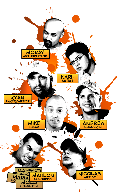
Karl, Ryan and Andrew recently paid a visit to 3rd year students at the Cape Technicon in connection with some comic projects that they are busy with so coming up on the blog will be a few tips and tricks of the comic trade to help out our up and coming comic stars!
Stay tuned!
Stay tuned!
Subscribe to:
Posts (Atom)